Some time ago I presented you a software to better estimate how relient palynological counting data can be, which I called stabiliseR. I’ve been working on a slightly different approach to represent the same information, and make it more appealing. I came to this animated bar chart:
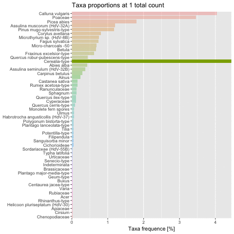
As you can see, each taxa proportion gets closer to its final value as the total count increases, and variations tend to decrease. The tidyverse and ggplot approach/magic made it very easy to impletement. You first need the gganimate package and then to include a frame argument in your plot’s aesthetics.
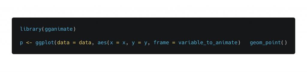
This will create a normal plot, ignoring the frame argument. But the gganimate() function can actually understand what it means:

This will create a GIF in your working directory with as many different frames as values in the variable_to_animate provided to the frame argument. It’s that easy!