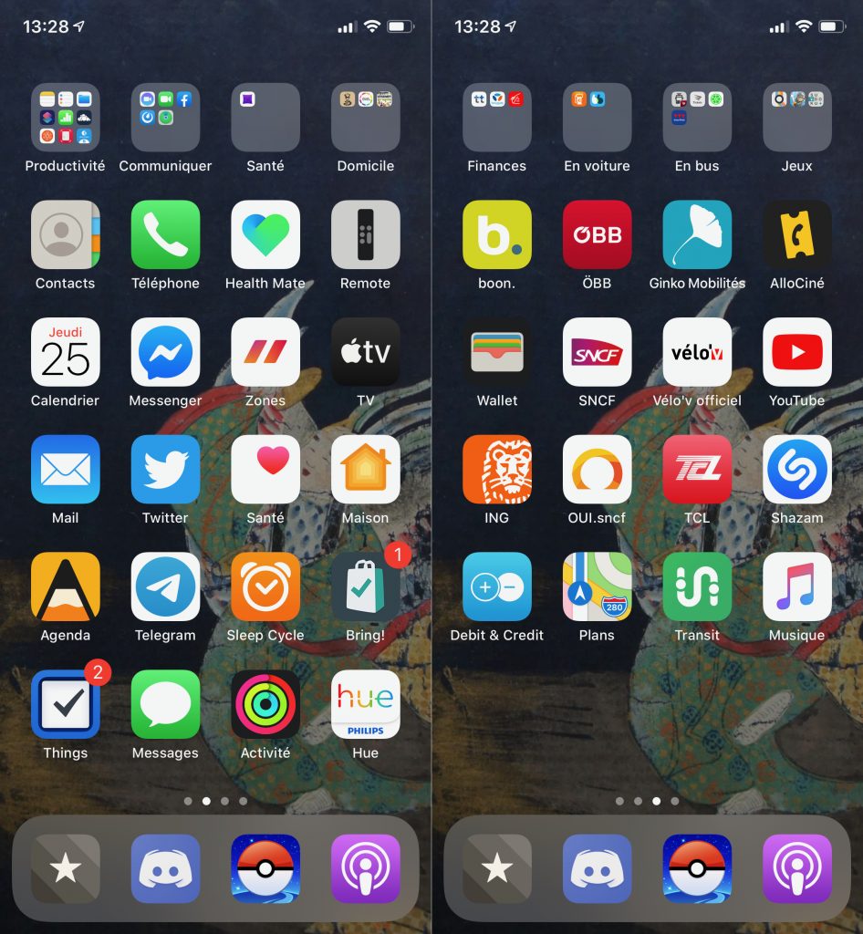
Once again, I religiously watched the World Wide Developer Conference. Please don’t judge me. I don’t consider myself a developer—even though I’ve already plaid with Xcode—, but I like to watch the WWDC to know what’s coming to macOS, iOS and iPadOS. Actually, since they are running the devices on which I can easily spend up to 10 hours a day (personal + professional use included), I don’t find it particularly crazy to stay posted. 😏
This year’s WWDC notably showcased the next version of the iPhone operating system: iOS 14. It seems like iOS 14 will bring some long-awaited flexibility on the springboard. The springboard is the rigid grid where apps get automatically sorted on your screen, from top-left to bottom-right, row by row. It has caused frustration and incomprehension to many people. I’ve always accepted it as it is, but I also developed a game-changing layout, and I thought I should tell you this story before iOS 14 shakes it around.
I think it was last year. I can’t recall when exactly, but I remember this day distinctly. I was on the train back to Innsbruck, going through the wonderful landscapes of Tyrolian mountains. At this place, the train slowly, carefully follows a unique railway (i.e. two trains can’t cross!) through the rocky, steep slopes, over the Inn Valley. I don’t know why, but it was a moment of intense communication, constantly switching between apps (Messages, Mail, WhatsApp, Telegram, etc.) depending on the person I was replying to. Something didn’t work, and it needed to change!
I stopped for a moment and I looked at the many pages of my springboard, and the apps it contained. I hadn’t used many of them since months, and I didn’t feel any need for it. The pages were also cluttered with many “folders”, typically where apps get buried forever, as I won’t remember they’re there. I started to delete all the useless apps, then I set a few simple principles:
– the more often I use an app, the more at the bottom of the screen it must lie
– distribute apps in categories, vertically
– keep only one folder at the top for the less used apps in each category
– keep an increasing number of empty row(s) to identify pages

Here you can see the result. You can see my apps for productivity when I’m on the go on the first column of the first page. It is mostly about emails and keeping track of my projects using Agenda and Things. The second column is about communicating with other people. That was the trigger of everything. Then health and home-related apps. You can see I’m a Pokémon GO player, and since it keeps me moving, I consider it as a health-related app. 🙂
On the second page you can see one empty line, which tells me instinctively what to expect from this page, without looking at the apps. There are money-money-things, apps for travels—car and train—, apps for mobility—city buses and bikes—, and entertainment. Look again how mobility apps are in line with Pokémon GO. They are on the third column, like the health-related apps of the first page. The same applies to the Podcast app. It lies on the very bottom line (i.e. it is visible on all pages), but is intentionally located on the fourth column just like other entertainment apps.
I don’t show the third page but it does have two empty lines and vertically aligned categories.
I use this structure since roughly one year, and it gives me great satisfaction! The conclusion I would draw is that a bit of thinking can make a big deal. I realise that the idea of “organising apps” can sound like too much, but it is highly beneficial. Something as silly as don’t finding an app on one’s own phone can be frustrating and contribute to bring someone down. That doesn’t happen to me anymore. I know that my apps are there, I know where to find them when I need them. Because of this, I safely leave my phone away without fearing of missing out, and I feel empowered.
If you’d like to try this way too, I really encourage you to start by deleting apps. Remove clutter to make room for a better use. #LessIsMore