I am currently augmenting the pollen data from two sites I studied during my PhD research, thanks to a grant from the Swiss Foundation for Alpine Studies. The one I’m dealing with at the moment is a small peat bog at a locality called Saglias, near the village of Ardez in the Grisons, Switzerland.
I usually seek for high quality and reliability of palynological data. Depending on the context, I try to identify about 1000 pollen grains per sample, or 500 tree pollen grains, and look at the taxa accumulation curve. These two indices are easily accessible in real-time counting thanks to PolyCounter, the software I’m using.
Now, some samples clearly want to drive analysts crazy. Most often they contain very few pollen grains. A typical reason for this is a poor pollen preservation. It can be useful to have a closer look at them and see if there is something one can do to improve the situation. I’m doing this by looking at a few other parameters. Again, PolyCounter is your best friend. That’s easy to import the count data and metadata (such as the number of marker spiked added) into R and compute variables to address key questions:
- how many marker were counted?
marker_counted - which proportion of the total marker added does it represent?
marker_prop - what is the total pollen concentration of the sample?
pollen_conc - did I count at least 1 marker for 2 pollen grains for reliable concentration values?
ratio_mp > 0.5
quality_control
# A tibble: 113 x 7
   depth pollen_sum marker_counted marker_total marker_prop pollen_conc ratio_mp
   <dbl>      <dbl>          <dbl>        <dbl>       <dbl>       <dbl>    <dbl>
 1    14        550           2634        13500      0.195        2819.     4.79
 2    22        933           1090        13500      0.0807      11556.     1.17
 3    30        880           1792        13500      0.133        6629.     2.04
 4    38       1052           1685        13500      0.125        8428.     1.60
 5    46        594           1459        13500      0.108        5496.     2.46
 6    54        573           1036        13500      0.0767       7467.     1.81
 7    62        835           1410        13500      0.104        7995.     1.69
 8    70        594           1198        13500      0.0887       6694.     2.02
 9    78        586           1303        13500      0.0965       6071.     2.22
10    86       1774           2978        13500      0.221        8042.     1.68
# … with 103 more rows
I’m not going to explain how to get this since it is a bit off-topic, but I’d be happy to provide assistance if you’d like to do it.
Then, a bit of ggplot magic does the trick:
core_name <- "ASG-2012"
qual_plot_title <- str_c("Quality Control of Palynological Data from the ", core_name, " Core")
quality_control %>%
  ggplot(aes(pollen_sum, marker_counted)) +
  geom_abline(slope = 0.5, linetype = "dashed") +
  geom_path(alpha = 0.1) +
  geom_point(aes(size = pollen_conc, colour = marker_prop)) +
  geom_text(aes(label = depth), hjust = -0.1, vjust = -0.1) +
  scale_colour_viridis_c(direction = -1) +
  coord_trans(x = "log10", y = "log10") +
  labs(
    title = qual_plot_title,
    subtitle = str_c("From count data of ", nrow(quality_control), " samples, labelled by depth, as of ", Sys.Date()),
    x = "Pollen sum",
    y = "Marker counted",
    colour = "Proportion of marker counted",
    size = "Pollen concentration"
  ) +
  theme(legend.position = "bottom") +
  guides(
    colour = guide_colourbar(title.position = "top", barwidth = unit(6, "cm")),
    size   = guide_legend(   title.position = "top")
    )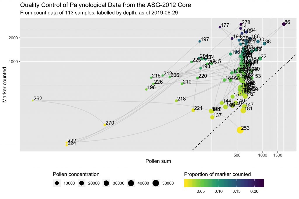
This is a scatterplot of marker counted against pollen sum for each sample, with log scales to emphasize small values. Concentration is evidenced as size of dots, and the proportion of marker spikes counted over the total added is shown with a colour gradient. The dashed line represents the 1-marker / 2-pollen ratio (= 0.5).
Smaller dots therefore indicate poor pollen preservation. Yellow dots indicate samples that didn’t benefit from a significant counting effort. The x and y axes (pollen sum and marker spikes counted) indicate right away the counting effort, and help to represent the counting ratio (ie the dashed line).
Three samples have a counting ratio lower than 0.5. Not much marker spikes were counted for these samples. Concentration seem to be high but it could be biased. The situation of these samples is not catastrophic but it could be worth counting a little bit more and see if it helps.
A dozen of other samples show pollen sums of about 200–250 pollen grains, and 500–1000 marker spikes counted. The concentration appears to be low, and it is probably reliable given the high proportion of marker spikes counted. Investing a bit of time here could eventually improve the reliability of the data, but the taxa accumulation curve looked already pretty good. Maybe that’s just the way it is.
The most concerning are the four samples in the bottom-left hand corner. Very low pollen sum, and very low marker spikes counted. In other words, the slides were almost empty. It could indicate a problem during the preparation of the samples. A closer attention to them is much needed!
Finally, the subtle, transparent, grey lines that connect samples help to see if the same concerns regarding pollen preservation and data quality would apply to clusters of successive samples. This would point for instance to environmental factors as a potential cause.
I am using these diagnosis tools to help making pragmatic decisions. I’m trying to reach as reliable data as possible, as fast as possible. After a first run of analyses, I can come to this plot and see where are the bigger flaws regarding the quality of data. The situation of some samples will be easy and fast to fix with, say, one extra hour of counting, while for some other it is probably not worth it. That would be a loss of a precious resource in scientific research: time.